KryptonGroupBox
Overview
KryptonGroupBox displays a framed area with an optional caption for grouping related controls. It combines border, background, and caption rendering with an inner KryptonGroupBoxPanel for child controls.
Namespace: Krypton.Toolkit
Assembly: Krypton.Toolkit
Default property: ValuesPrimary (caption values)
Inheritance: VisualControlContainment → KryptonGroupBox
Key features
- Caption with overlap, edge, orientation, and visibility
CaptionValuesfor heading text and imagesGroupBackStyle/GroupBorderStyle/CaptionStyle- Inner
Panelfor child controls - Auto-size with
GrowAndShrinkdefault - Optional themed scroll bars
Constructor
public KryptonGroupBox()
Properties
Panel
public KryptonGroupBoxPanel Panel { get; }
Inner surface for child controls.
Values
public CaptionValues Values { get; }
Caption text, image, and related content. Text on the control maps to caption heading.
CaptionOverlap
[DefaultValue(0.5)]
public double CaptionOverlap { get; set; }
Default: 0.5 (50%) — border draws through the caption vertically.
1.0 places the caption outside the border; 0.0 places it fully inside.
GroupBackStyle / GroupBorderStyle
[DefaultValue(PaletteBackStyle.ControlGroupBox)]
public PaletteBackStyle GroupBackStyle { get; set; }

[DefaultValue(PaletteBorderStyle.ControlGroupBox)]
public PaletteBorderStyle GroupBorderStyle { get; set; }
CaptionStyle
[DefaultValue(LabelStyle.GroupBoxCaption)]
public LabelStyle CaptionStyle { get; set; }
Palette label style for the caption.
CaptionEdge / CaptionOrientation / CaptionVisible
public VisualOrientation CaptionEdge { get; set; }
public ButtonOrientation CaptionOrientation { get; set; }
public bool CaptionVisible { get; set; }
Position and visibility of the caption.
StateCommon / StateDisabled / StateNormal
public PaletteGroupBoxRedirect StateCommon { get; }
public PaletteGroupBox? StateDisabled { get; }
public PaletteGroupBox? StateNormal { get; }
Back, border, and content overrides for the frame and caption.
AutoSize / AutoSizeMode
[DefaultValue(AutoSizeMode.GrowAndShrink)]
public AutoSizeMode AutoSizeMode { get; set; }
UseKryptonScrollbars
Themed scroll bars on the inner panel when content overflows.
Visual states
Normal and Disabled only. Customize via StateNormal and StateDisabled; defaults come from StateCommon.
Examples of appearance
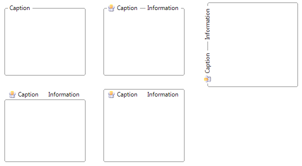
Figure 1 — GroupBackStyle and GroupBorderStyle = ControlGroupBox (default)
Usage example
kryptonGroupBox1.Values.Heading = "Connection";
kryptonGroupBox1.CaptionOverlap = 1.0; // caption above border
kryptonGroupBox1.Panel.Padding = new Padding(8);
Best practices
- Use
Values.Heading(orText) for the caption; child controls go onPanel. - Adjust
CaptionOverlapwhen the default 50% overlap does not match your layout.