KryptonForm
Overview
KryptonForm derives from VisualForm (which derives from System.Windows.Forms.Form) and is the intended base class for every application window in a Krypton-themed application. By inheriting from KryptonForm instead of the stock Form, all border and caption chrome is drawn using the active Krypton palette, ensuring a visually consistent look and feel across the entire application — including the window chrome itself.
KryptonForm also implements IContentValues, allowing the title bar to be treated as a styled Krypton content element, with support for icon, short-text (title) and long-text (TextExtra) rendering.
Inheritance Hierarchy
System.Object
  └─ System.MarshalByRefObject
       └─ System.ComponentModel.Component
            └─ System.Windows.Forms.Control
                 └─ System.Windows.Forms.ScrollableControl
                      └─ System.Windows.Forms.ContainerControl
                           └─ System.Windows.Forms.Form
                                └─ Krypton.Toolkit.VisualForm
                                     └─ Krypton.Toolkit.KryptonForm
Getting Started
Minimum Setup
Change the base class of any Form in your project to KryptonForm:
public partial class MainForm : KryptonForm
{
    public MainForm()
    {
        InitializeComponent();
    }
}
The form will now participate in Krypton palette theming automatically. No further configuration is required for the default appearance.
Designer Support
KryptonForm is fully supported in the Visual Studio WinForms designer. All palette state properties (StateCommon, StateActive, StateInactive) are serialisable sub-objects and appear in the Properties window. ButtonSpecs and TitleBar are also designer-serialisable.
Architecture
Internal Panel
Controls added to the form at design time are physically parented to an internal KryptonPanel (InternalKryptonPanel), not to the form itself. This panel fills the client area, takes part in Krypton palette theming and ensures that child controls inherit the correct background. The Controls property is overridden to transparently redirect to InternalKryptonPanel.Controls unless IsMdiContainer is true or SetInheritedControlOverride has been called.
Tip: Use
InternalPanel(the public accessor) to interact with the underlyingKryptonPaneldirectly if needed.
View Tree
The non-client chrome is painted through a lightweight retained view-tree:
| Element | Role |
|---|---|
ViewDrawForm (_drawDocker) |
Root docker; draws the form border/background |
ViewDecoratorFixedSize (_headingFixedSize) |
Enforces caption height |
ViewDrawDocker (_drawHeading) |
Draws the caption header (back + border) |
ViewDrawContent (_drawContent) |
Draws icon, title text and TextExtra |
ViewLayoutNull (_layoutNull) |
Fill placeholder for the client area |
Button Management
Three separate managers handle caption buttons:
_buttonManager— manages the user-definedButtonSpecscollection and the fixed Min/Max/Close buttons on_drawHeading._titleBarButtonManager— manages buttons from an attachedKryptonFormTitleBarcomponent, rendered in_titleBarDocker.- System menu is surfaced through
KryptonSystemMenu/SystemMenuValues.
Palette Redirect
FormPaletteRedirect (an internal PaletteRedirect subclass) intercepts horizontal alignment queries for header content. It transparently handles:
FormTitleAligncustomisation.- RTL +
RightToLeftLayouttitle/icon mirroring: title is placed on theFarside,TextExtraon theNearside, and the icon is flipped toFar.
Appearance Properties
GroupBackStyle
public PaletteBackStyle GroupBackStyle { get; set; }
// Default: PaletteBackStyle.FormMain
Controls the background style of the custom chrome region (the form border area). Maps to StateCommon.BackStyle.
GroupBorderStyle
public PaletteBorderStyle GroupBorderStyle { get; set; }
// Default: PaletteBorderStyle.FormMain
Controls the border style of the custom chrome region. Maps to StateCommon.BorderStyle.
HeaderStyle
public HeaderStyle HeaderStyle { get; set; }
// Default: HeaderStyle.Form
Defines the palette style used to draw the caption/title bar header. Can be set to any HeaderStyle value (e.g. Primary, Secondary, DockActive, Calendar, Custom1–Custom3) to completely restyle the caption using a different palette entry.
FormTitleAlign
public PaletteRelativeAlign FormTitleAlign { get; set; }
// Default: PaletteRelativeAlign.Near
Controls the horizontal alignment of the title text within the caption area. Accepts Near (left), Center, or Far (right). Ignored in RTL mode — see the RTL section below.
Note: When a Material renderer is active, this is automatically set to
Centerfor a modern look. The user can override this afterLoad.
TitleStyle
public KryptonFormTitleStyle TitleStyle { get; set; }
// Default: KryptonFormTitleStyle.Inherit
A convenience wrapper over FormTitleAlign:
| Value | Maps to FormTitleAlign |
|---|---|
Inherit |
PaletteRelativeAlign.Inherit |
Classic |
PaletteRelativeAlign.Near |
Modern |
PaletteRelativeAlign.Center |
TextExtra
public string? TextExtra { get; set; }
// Default: ""
An additional string displayed in the caption area alongside the title text. Rendered as the long text of the caption content element. Useful for showing sub-titles, document names, or other secondary information.
Example output: MyApp – [Document1] where Text = "MyApp" and TextExtra = "– [Document1]".
Two-State Palette
KryptonForm uses two visual states:
| State | Description |
|---|---|
| Active | Applied when the window has input focus |
| Inactive | Applied when the window is in the background |
State Properties
| Property | Type | Description |
|---|---|---|
StateCommon |
PaletteFormRedirect |
Shared base values; overridden by state-specific entries |
StateActive |
PaletteForm |
Active (focused) window appearance |
StateInactive |
PaletteForm |
Inactive (background) window appearance |
Each PaletteForm exposes .Back (background), .Border (border) and .Header (caption header with .Back, .Border, .Content) for granular customisation.
Example — Red border when active, blue when inactive:
myForm.StateActive.Border.Color1 = Color.Red;
myForm.StateInactive.Border.Color1 = Color.Blue;
Custom Chrome
UseThemeFormChromeBorderWidth
public new bool UseThemeFormChromeBorderWidth { get; set; }
// Default: true
Master switch for custom Krypton chrome on this form instance. Three conditions must all be true for chrome to be active:
KryptonForm.UseThemeFormChromeBorderWidth— this property.KryptonManager.UseThemeFormChromeBorderWidth— global switch.- The resolved palette's
UseThemeFormChromeBorderWidthreturnsInheritBool.True.
When custom chrome is not active, the form displays the standard OS-provided window chrome.
Formerly named
AllowFormChromein older Krypton versions; the underlying backing field is still_allowFormChrome.
FormBorderStyle
public new FormBorderStyle FormBorderStyle { get; set; }
// Default: FormBorderStyle.Sizable
Overrides the base Form.FormBorderStyle to synchronise the Krypton control buttons (Min/Max/Close) automatically when the style changes:
| Style | ControlBox | Min | Max | Close |
|---|---|---|---|---|
None |
✗ | ✗ | ✗ | ✗ |
FixedSingle, Fixed3D, FixedDialog, Sizable |
✓ | ✓ | ✓ | ✓ |
FixedToolWindow, SizableToolWindow |
✗ | ✗ | ✗ | ✓ |
InertForm
public bool InertForm { get; set; }
// Default: false
When true, all hit-testing in the custom chrome returns HTCLIENT, preventing the user from moving the window by dragging the caption or resizing via the borders. Useful for splash screens and locked layouts.
CustomCaptionArea
public Rectangle CustomCaptionArea { get; set; }
// Default: Rectangle.Empty
Specifies a rectangle in form client coordinates that should be treated as caption area for hit-testing purposes. Primarily used internally by KryptonRibbon to mark the tab/QAT row as a draggable caption region. Can be used by custom integrations that inject content into the caption area.
Window Control Buttons
Built-in Buttons
The Minimize, Maximize/Restore, and Close buttons are implemented as ButtonSpec instances and are fully palette-aware. They are accessed via:
public ButtonSpecFormWindowMin  ButtonSpecMin   { get; }
public ButtonSpecFormWindowMax  ButtonSpecMax   { get; }
public ButtonSpecFormWindowClose ButtonSpecClose { get; }
These are not shown in the designer but can be programmatically referenced for hit-test queries:
bool overClose = myForm.HitTestCloseButton(windowPoint);
bool overMax   = myForm.HitTestMaxButton(windowPoint);
bool overMin   = myForm.HitTestMinButton(windowPoint);
MinimizeBox / MaximizeBox / CloseBox / ControlBox
public new bool MinimizeBox { get; set; } // Default: true
public new bool MaximizeBox { get; set; } // Default: true
public new bool CloseBox    { get; set; } // Default: true
public new bool ControlBox  { get; set; } // Default: true
All override the base Form properties to additionally trigger a button-manager repaint (_buttonManager.PerformNeedPaint(true)) so the chrome updates immediately.
ButtonSpecs — Custom Caption Buttons
public FormButtonSpecCollection ButtonSpecs { get; }
A collection of ButtonSpecAny instances that appear in the caption area alongside the system buttons. Each ButtonSpec controls:
Image/Text— visual content.Edge—Near(left) orFar(right) placement relative to existing buttons.Visible/Enabled— runtime visibility/interactivity.ToolTipTitle/ToolTipBody/ToolTipStyle— tooltip content and style.KryptonCommand— bind to aKryptonCommandfor automatic enable/disable and state management.Clickevent — raised when the button is clicked.
Example — Adding a settings button to the right of the caption:
var settingsBtn = new ButtonSpecAny
{
    Type    = PaletteButtonSpecStyle.Generic,
    Image   = Properties.Resources.SettingsIcon,
    Edge    = PaletteRelativeEdgeAlign.Far,
    ToolTipTitle = "Settings"
};
settingsBtn.Click += (s, e) => ShowSettingsDialog();
myForm.ButtonSpecs.Add(settingsBtn);
AllowButtonSpecToolTips
public bool AllowButtonSpecToolTips { get; set; }
// Default: false
When true, hovering over a ButtonSpec in the caption area shows a Krypton-themed tooltip. Use ButtonSpec.ToolTipTitle / ButtonSpec.ToolTipBody to define content.
KryptonFormTitleBar — Embedded Title Bar Toolbar
KryptonFormTitleBar is a non-visual component that hosts a secondary set of ButtonSpecAny buttons inside the caption area, to the left of the title text (after the form icon). It mirrors the approach used by KryptonRibbon to embed the Quick Access Toolbar in the caption.
Attaching
- Drop a
KryptonFormTitleBarcomponent onto the form. - Set
KryptonForm.TitleBar = myTitleBar(or use the designer property drop-down). - Add
ButtonSpecAnyitems tomyTitleBar.ButtonSpecs.
public KryptonFormTitleBar? TitleBar { get; set; }
// Default: null
Setting TitleBar to null cleanly detaches and disposes the embedded docker and button manager.
KryptonFormTitleBar Members
| Member | Type | Description |
|---|---|---|
ButtonSpecs |
FormTitleBarButtonSpecCollection |
Collection of buttons shown in the title bar |
ShowDropArrow |
bool |
When true, all buttons with a KryptonContextMenu show a drop arrow |
Values |
FormTitleBarValues |
Stores ButtonVisibility and ButtonAlignment sub-objects |
OwnerForm |
KryptonForm? |
Back-reference to the owning form; null when detached |
InsertStandardItems() |
method | Populates ButtonSpecs with a standard File/Edit/Tools/Help menu set plus common toolbar actions |
InsertStandardItems
Calling InsertStandardItems() (or using the designer verb) adds a standard set of buttons to the title bar:
Menu buttons: File, Edit, Tools, Help (each with a dropdown KryptonContextMenu).
Toolbar buttons: New, Open, Save, Save As, Save All, Cut, Copy, Paste, Undo, Redo, Page Setup, Print Preview, Print, Quick Print.
All labels are taken from KryptonManager.Strings and are therefore localisation-aware. Wire ButtonSpecAny.Click or context menu item Click events to implement the actions.
FormTitleBarValues
KryptonFormTitleBar.Values exposes two nested objects:
ButtonVisibility
Controls whether each standard toolbar button is visible:
titleBar.Values.ButtonVisibility.ShowNewButton        = true;
titleBar.Values.ButtonVisibility.ShowSaveButton       = true;
titleBar.Values.ButtonVisibility.ShowPrintButton      = false;
// ... ShowOpenButton, ShowSaveAsButton, ShowSaveAllButton,
//     ShowCutButton, ShowCopyButton, ShowPasteButton,
//     ShowUndoButton, ShowRedoButton, ShowPageSetupButton,
//     ShowPrintPreviewButton, ShowQuickPrintButton
ButtonAlignment (FormTitleBarButtonAlignment)
Controls the caption edge (Near or Far) for each standard toolbar button:
titleBar.Values.ButtonAlignment.NewButtonAlignment  = PaletteRelativeEdgeAlign.Near;
titleBar.Values.ButtonAlignment.SaveButtonAlignment = PaletteRelativeEdgeAlign.Far;
// ... OpenButtonAlignment, SaveAsButtonAlignment, SaveAllButtonAlignment,
//     CutButtonAlignment, CopyButtonAlignment, PasteButtonAlignment,
//     UndoButtonAlignment, RedoButtonAlignment, PageSetupButtonAlignment,
//     PrintPreviewButtonAlignment, PrintButtonAlignment, QuickPrintButtonAlignment
Status Strip Merging
AllowStatusStripMerge
public bool AllowStatusStripMerge { get; set; }
// Default: true
When true, the form attempts to merge a StatusStrip control into the lower border area, producing an integrated, Office-style look.
Merge conditions — all must be met:
AllowStatusStripMergeistrue.- A
StatusStripis present andVisible. StatusStrip.Dock == DockStyle.Bottom.StatusStrip.Bottom == ClientRectangle.Bottom(strip fills the full width at the bottom).StatusStrip.RenderMode == ToolStripRenderMode.ManagerRenderMode.ToolStripManager.Rendereris one of the Office/Krypton-compatible renderers (KryptonOffice2007Renderer,KryptonVisualStudio2010With2007Renderer, orKryptonSparkleRenderer).

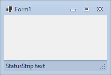
Figure 1 — StatusStripMerging = True and False
The StatusStripMerging property (internal, read-only) reflects the computed merge state.
Blur Effect
KryptonForm integrates with the BlurValues sub-system (owned by VisualForm) to apply a Gaussian blur to the form when it loses focus.
BlurValues Members
| Property | Type | Default | Description |
|---|---|---|---|
BlurWhenFocusLost |
bool |
false |
Enable blur when the form loses focus |
Opacity |
byte |
80 |
Blur opacity percentage (0–100) |
Note: The blur effect is implemented at the
VisualFormlevel and requires platform support. BothBlurWhenFocusLostandEnableBlur(onVisualForm) must betrueto activate the effect.

Figure 2 — Blur effect in action
System Menu
KryptonForm provides a styled Krypton system menu that replaces the default OS context menu shown when right-clicking the title bar or clicking the form icon.
SystemMenuValues
public SystemMenuValues SystemMenuValues { get; }
| Property | Type | Default | Description |
|---|---|---|---|
Enabled |
bool |
true |
Enables or disables the themed system menu |
MenuItems |
KryptonContextMenuCollection |
— | Direct access to the menu item collection for customisation |
When Enabled is false, clicking the form icon posts a WM_CONTEXTMENU to the standard system handler instead.
Example — Adding a custom item to the system menu:
var customItem = new KryptonContextMenuItem("About…");
customItem.Click += (s, e) => ShowAboutDialog();
myForm.SystemMenuValues.MenuItems.Add(customItem);
Drop Shadow
[Obsolete("Deprecated - Only use if you are using Windows 7, 8 or 8.1.")]
public bool UseDropShadow { get; set; }
// Default: false
Adds a CS_DROPSHADOW class style to the window. This is deprecated and only relevant on Windows 7/8/8.1. Windows 10 and later provide a native drop shadow for all top-level windows automatically.
Administrator Mode
KryptonForm can detect whether the current process is running with elevated (administrator) privileges.
public bool IsInAdministratorMode { get; }                           // instance
public static bool GetIsInAdministratorMode()                        // static, cached
public static bool GetHasCurrentInstanceGotAdministrativeRights()    // static, live check
public static void SetIsInAdministratorMode(bool value)              // static, manual override
When KryptonManager.UseAdministratorSuffix is true and the process is elevated, the title bar automatically appends (Administrator) (from KryptonManager.Strings.GeneralStrings.Administrator) to the form title returned by GetShortText().
Caption Content (IContentValues)
KryptonForm implements IContentValues to supply content to the caption's ViewDrawContent:
| Method | Returns | Description |
|---|---|---|
GetShortText() |
string |
Text + optional administrator suffix |
GetLongText() |
string |
TextExtra value |
GetImage(PaletteState) |
Image? |
DPI-scaled form icon bitmap (cached) |
GetImageTransparentColor(PaletteState) |
Color |
Always EMPTY_COLOR (no transparency) |
The icon is rendered at 16×16 logical pixels, scaled by the current DPI factor. When AllowIconDisplay is false, or FormBorderStyle is a style that does not show icons, GetImage returns null.
Right-to-Left Support
KryptonForm fully supports RTL layouts:
public override RightToLeft RightToLeft { get; set; }
// Default: RightToLeft.No
When RightToLeft = RightToLeft.Yes and RightToLeftLayout = true:
- The title text is placed on the
Far(right) edge. TextExtrais placed on theNear(left) edge.- The form icon is placed on the
Far(right) edge. - The Min/Max/Close buttons migrate to the left.
- The sizing grip is placed in the bottom-left corner.
- The system menu corner hit-test (top-left corner) triggers a close instead of the system menu.
FormPaletteRedirectintercepts the palette alignment queries to implement all of the above transparently.
Button managers are recreated whenever RightToLeft or RightToLeftLayout changes.
Sizing Grip
The sizing grip is rendered as a client-area overlay (painted in WM_PAINT), independent of the OS-provided non-client grip.
Visibility logic (ShouldShowSizingGrip):
SizeGripStyle != SizeGripStyle.Hide.FormBorderStyleisSizableorSizableToolWindow.WindowStateisNormal.- No merged
StatusStripwith its ownSizingGrip. SizeGripStyleisAutoorShow.
Rendering priority:
- Themed bitmap image from
palette.GetSizeGripImage(rtl)(DPI-scaled, magenta colour-key transparency). - Fallback: diagonal dot pattern using palette-derived, contrast-checked colour.
The grip colour is resolved from the palette's border colour, falling back to the text colour, and finally to black or white based on background luminance.
MDI Support
KryptonForm overrides IsMdiContainer to route child controls correctly when MDI mode is activated:
public new bool IsMdiContainer { get; set; }
When IsMdiContainer = true is set, controls are moved from _internalKryptonPanel to the base Controls collection. SetInheritedControlOverride() can be called explicitly to trigger the same transfer when inheriting from KryptonForm in a MDI scenario.
Background Image
public override Image? BackgroundImage { get; set; }
Redirected to _internalKryptonPanel.StateCommon.Image, so the background image is rendered by the internal panel's palette system rather than the base Form background paint.
public PaletteImageStyle ImageStyle { get; set; }
// Default: PaletteImageStyle.Inherit
Controls how BackgroundImage is tiled/stretched/positioned within the client area.
Hidden/Suppressed Base Members
The following Form properties are hidden in the designer (Browsable(false) / EditorBrowsable(Never)) because they conflict with Krypton's palette-driven approach:
| Member | Reason suppressed |
|---|---|
Font |
Krypton controls inherit font from the palette |
ForeColor |
Managed by palette |
BackColor |
Managed by palette; the internal panel handles client background |
BackgroundImageLayout |
Use ImageStyle instead |
Overridable Protected Members
The following protected members are intended for subclass customisation:
| Method | Description |
|---|---|
WindowChromeStart() |
Called when custom chrome painting begins (creates buttons) |
WindowChromeEnd() |
Called when custom chrome painting ends (removes border region) |
WindowChromeHitTest(Point) |
Override to customise hit-testing in the non-client area |
WindowChromePaint(Graphics, Rectangle) |
Override to customise chrome painting |
WindowChromeLeftMouseDown(Point) |
Override to handle left mouse down in chrome area |
OnWM_NCLBUTTONDOWN(ref Message) |
Override to intercept non-client left button down (icon single-click) |
OnWM_NCLBUTTONDBLCLK(ref Message) |
Override to intercept non-client double-click (double-clicking icon closes the form) |
OnWM_NCCALCSIZE(ref Message) |
Override to adjust the non-client size calculation |
OnWindowActiveChanged() |
Called when the window gains or loses focus; switches between StateActive/StateInactive |
OnNonClientPaint(IntPtr) |
Called to paint the non-client area |
CreateRedirector() |
Returns the FormPaletteRedirect; override to inject a custom redirector |
WndProc Customisations
KryptonForm.WndProc handles the following Windows messages in addition to the base class:
| Message | Behaviour |
|---|---|
WM_HELP (0x0053) |
Walks up the control tree to find a HelpProvider and calls Help.ShowHelp |
WM_CONTEXTMENU (0x007B) |
Shows ContextMenuStrip at the click position if one is assigned |
WM_PAINT (0x000F) |
After base paint, draws the sizing grip overlay if ShouldShowSizingGrip() is true |
Global Event Subscriptions
KryptonForm subscribes to three KryptonManager global events for the lifetime of the instance:
| Event | Handler | Effect |
|---|---|---|
GlobalPaletteChanged |
OnGlobalPaletteChanged |
Re-evaluates chrome decision; applies Material defaults; recalculates non-client |
GlobalUseThemeFormChromeBorderWidthChanged |
OnGlobalUseThemeFormChromeBorderWidthChanged |
Re-evaluates chrome decision |
GlobalTouchscreenSupportChanged |
OnGlobalTouchscreenSupportChanged |
Recreates all caption buttons to resize for touch targets |
These event handlers are unsubscribed in Dispose(bool).
.NET 10 Compatibility
On .NET 10 and later, KryptonForm sets:
FormCornerPreference = FormCornerPreference.DoNotRound;
This prevents the platform's FormCornerPreference feature from rounding form corners, which would cause flicker during resize when combined with Krypton's custom chrome rendering.
Borderless Form Fade-in
When FormBorderStyle == FormBorderStyle.None and the form is shown for the first time, KryptonForm temporarily sets Opacity = 0, lets the form become visible, then restores the target opacity via BeginInvoke. This produces a smooth fade-in on Windows 11, which otherwise applies a built-in fade animation starting from full transparency.
View Injection API
These methods allow Krypton components (such as KryptonRibbon) to embed custom view elements into the caption area:
[EditorBrowsable(EditorBrowsableState.Never)]
public void InjectViewElement(ViewBase element, ViewDockStyle style)

[EditorBrowsable(EditorBrowsableState.Never)]
public void RevokeViewElement(ViewBase element, ViewDockStyle style)
When style == ViewDockStyle.Fill, the incoming element must be a ViewLayoutDocker; the existing _drawContent is re-parented inside it, so the title text and icon remain visible. For any other style, the element is simply docked to the specified edge.
Static Utility Methods
| Method | Description |
|---|---|
GetIsInAdministratorMode() |
Returns cached administrator-mode flag; performs a live check on first call |
GetHasCurrentInstanceGotAdministrativeRights() |
Performs a live WindowsPrincipal check and caches the result |
SetIsInAdministratorMode(bool) |
Manually overrides the cached administrator flag (for testing / impersonation) |
Full Public API Reference
Properties
| Property | Type | Default | Category | Description |
|---|---|---|---|---|
AllowButtonSpecToolTips |
bool |
false |
Visuals | Show tooltips on caption ButtonSpec items |
AllowIconDisplay |
bool |
true |
— | Internal; controls whether the form icon is rendered |
AllowStatusStripMerge |
bool |
true |
Visuals | Merge bottom StatusStrip into the chrome border |
ActiveControl |
Control? |
null |
— | Sets focus to the specified control on assignment |
BackgroundImage |
Image? |
null |
Visuals | Background image (stored in internal panel) |
BackgroundImageLayout |
ImageLayout |
— | — | Inherited; use ImageStyle for palette-aware control |
ButtonSpecClose |
ButtonSpecFormWindowClose |
— | — | Access to the Close button spec |
ButtonSpecMax |
ButtonSpecFormWindowMax |
— | — | Access to the Maximize/Restore button spec |
ButtonSpecMin |
ButtonSpecFormWindowMin |
— | — | Access to the Minimize button spec |
ButtonSpecs |
FormButtonSpecCollection |
— | Visuals | User-defined caption buttons |
CloseBox |
bool |
true |
Window Style | Show/hide the Close button |
ControlBox |
bool |
true |
Window Style | Show/hide the entire control box |
Controls |
Control.ControlCollection |
— | — | Redirected to internal panel (or base in MDI mode) |
CustomCaptionArea |
Rectangle |
Rectangle.Empty |
— | Rectangle (client coords) treated as caption for dragging |
FormBorderStyle |
FormBorderStyle |
Sizable |
Appearance | Border style; auto-syncs Min/Max/Close buttons |
FormTitleAlign |
PaletteRelativeAlign |
Near |
Visuals | Horizontal alignment of title text |
GroupBackStyle |
PaletteBackStyle |
FormMain |
Visuals | Background style for chrome region |
GroupBorderStyle |
PaletteBorderStyle |
FormMain |
Visuals | Border style for chrome region |
HeaderStyle |
HeaderStyle |
Form |
Visuals | Palette header style for the caption bar |
ImageStyle |
PaletteImageStyle |
Inherit |
Visuals | Layout style for BackgroundImage |
InertForm |
bool |
false |
— | Disable window move and resize via chrome hit-test |
InternalPanel |
KryptonPanel |
— | — | Direct access to the internal KryptonPanel |
IsInAdministratorMode |
bool |
— | Appearance | Whether the current process is elevated |
IsMdiContainer |
bool |
false |
Window Style | MDI container mode |
MaximizeBox |
bool |
true |
Window Style | Show/hide the Maximize button |
MinimizeBox |
bool |
true |
Window Style | Show/hide the Minimize button |
RightToLeft |
RightToLeft |
No |
— | RTL mode; triggers button recreation |
StateActive |
PaletteForm |
— | Visuals | Active window appearance overrides |
StateCommon |
PaletteFormRedirect |
— | Visuals | Shared appearance base; other states override this |
StateInactive |
PaletteForm |
— | Visuals | Inactive window appearance overrides |
SystemMenuValues |
SystemMenuValues |
— | — | Themed system menu configuration |
TextExtra |
string? |
"" |
Appearance | Secondary caption text (long text) |
TitleBar |
KryptonFormTitleBar? |
null |
Visuals | Embedded title bar toolbar component |
TitleStyle |
KryptonFormTitleStyle |
Inherit |
Appearance | Convenience wrapper for FormTitleAlign |
ToolTipManager |
ToolTipManager |
— | — | Tooltip infrastructure for caption buttons |
UseDropShadow |
bool |
false |
Visuals | Legacy drop shadow (Windows 7/8 only; deprecated) |
UseThemeFormChromeBorderWidth |
bool |
true |
Visuals | Enable/disable custom Krypton chrome for this form |
Methods
| Method | Description |
|---|---|
GetWindowState() |
Returns the current FormWindowState directly from the Win32 window style (more accurate than WindowState) |
HitTestMinButton(Point) |
Returns true if the window-coordinate point is inside the Minimize button |
HitTestMaxButton(Point) |
Returns true if the window-coordinate point is inside the Maximize button |
HitTestCloseButton(Point) |
Returns true if the window-coordinate point is inside the Close button |
RecreateMinMaxCloseButtons() |
Schedules recreation of the Min/Max/Close button views on next layout |
SetInheritedControlOverride() |
Bypasses the internal panel; use when inheriting KryptonForm in MDI-aware scenarios |
UpdateDropShadowDraw(bool) |
Forces a drop shadow repaint (deprecated, for legacy use) |
InjectViewElement(ViewBase, ViewDockStyle) |
Injects a view element into the caption view tree |
RevokeViewElement(ViewBase, ViewDockStyle) |
Removes a previously injected view element from the caption view tree |
GetIsInAdministratorMode() |
Static; returns cached elevation state |
GetHasCurrentInstanceGotAdministrativeRights() |
Static; performs a live elevation check |
SetIsInAdministratorMode(bool) |
Static; manually sets the cached elevation state |
SuspendLayout() / ResumeLayout(bool) |
Overridden to coordinate the internal panel's ISupportInitialize lifecycle |
Common Usage Patterns
Palette-Themed Dialog
public partial class SettingsDialog : KryptonForm
{
    public SettingsDialog()
    {
        InitializeComponent();
        TextExtra = "– Settings";
        FormTitleAlign = PaletteRelativeAlign.Center;
        StateActive.Border.Color1 = Color.SteelBlue;
    }
}
Borderless / Splash Screen
public partial class SplashForm : KryptonForm
{
    public SplashForm()
    {
        InitializeComponent();
        FormBorderStyle = FormBorderStyle.None; // Auto-disables all control buttons
        InertForm = true;                        // Prevent accidental dragging
        Opacity = 0.95;
    }
}
Title Bar Toolbar
// In the designer: set myForm.TitleBar = kryptonFormTitleBar1
// Then at runtime or in designer:
kryptonFormTitleBar1.InsertStandardItems();
kryptonFormTitleBar1.Values.ButtonVisibility.ShowPrintButton = false;
kryptonFormTitleBar1.Values.ButtonVisibility.ShowPageSetupButton = false;
Administrator Suffix
KryptonManager.UseAdministratorSuffix = true;
// Title bar will now show:  "My App (Administrator)"  when elevated
Centered Title (Material Theme)
// Material themes auto-center the title; to opt out after load:
protected override void OnLoad(EventArgs e)
{
    base.OnLoad(e);
    FormTitleAlign = PaletteRelativeAlign.Near; // override Material default
}
Known Limitations and Notes
FontandForeColorare no-ops: SettingFontorForeColoron aKryptonFormhas no effect; fonts and colours are governed by the palette. Use the palette'sStateCommon.Header.Contentto set caption font.BackColoris no-op: The client area background is painted by the internalKryptonPanel. To change the form background colour, modifyStateCommonof the panel viaInternalPanel.StateCommon.UseDropShadowis deprecated: On Windows 10 and later, native drop shadows are always active. Only use this flag for Windows 7/8 targets.- MDI + Ribbon: When a
KryptonRibbonis present in an MDI container form, the ribbon manages its own injection into the caption area and callsInjectViewElement/RevokeViewElementinternally. Do not manually manipulate these in that scenario. WindowStatevsGetWindowState(): The standardWindowStateproperty can be slightly stale because it is updated on the next message pump cycle.GetWindowState()reads the Win32 window style directly and is always current. Use it in custom hit-test and paint overrides.NET10_0_OR_GREATERcorner rounding: TheFormCornerPreference.DoNotRoundoverride only applies when targeting .NET 10+. On earlier runtimes this code is not compiled in.