KryptonTreeView
Use the KryptonTreeView when you need to present a hierarchical collection of
labeled items. If the number of items exceeds the number that can be displayed
then a scroll bar is automatically shown. Use the Nodes property to define the
top level root nodes of the hierarchy. Hook into the AfterSelect event to be
notified when the selected node is changed.
Appearance
Use the BackStyle, BorderStyle and ItemStyle properties to alter the
appearance of the control and the node items. The first two of these properties
define the appearance of the overall control but the ItemStyle is used to
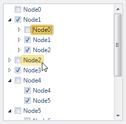
define the display of the individual node items themselves. You can see in
figure 1 the default appearance using the Office 2010 - Blue builtin palette.

Figure 1 – Default Appearance
Eight States
There are eight different states relating to the control but not all the states
are relevant to every part of the control.
The border and background of the control use just the StateNormal,
StateDisabled or StateActive sets of properties. If the control has been
disabled because the Enabled property is defined as False then the control
always uses the StateDisabled values. When the control is active the
StateActive properties are used and when not active the StateNormal. Being
currently active means it has the focus or the mouse is currently over the
control. Note that if the AlwaysActive property is defined as *True *then it
ignores the StateNormal and always uses the StateActive regardless of the
current active state of the control.
Drawing of the individual node items uses all the state properties except
StateActive. This is because the node items are not drawn differently
depending on the active state of the control. All the states that begin with the
StateChecked name are used for items that are currently selected. When not
selected an item uses one of the StateNormal, StateTracking or
StatePressed properties.
Common State
To speed up the customization process an extra StateCommon property has been
provided. The settings from this are used if no override has been defined for
the state specific entry. Note that the specific state values always take
precedence and so if you define the border width in StateNormal and
StateCommon then the StateNormal value will be used whenever the control is
in the Normal state. Only if the StateNormal value is not overridden will it
look in StateCommon.
Imagine the following scenario; you would like to define the border of the
button to be 3 pixels wide with a rounding of 2 pixels and always red. Without
the StateCommon property you would need to update the same three border settings
in each of StateDisabled, StateNormal, StateTracking etc properties.
Instead you can define the three border settings in just StateCommon and know
they will be used whichever of the states the tree view happens to be using.
Focus Override
If the control currently has the focus then the OverrideFocus settings are
applied to the item that has the focus indication. This can occur when the
control is in Normal, Tracking or Pressed states. By default the override
only alters the appearance so that a focus rectangle is drawn around the node
item contents so that the user can see that the control currently has the focus.
AlwaysActive
This property is used to indicate if the control should always be in the active
state. For an InputControlStyle of Standalone the default value of True is
appropriate. However, when you switch to using the InputControlStyle of
Ribbon you should alter this to False.* *A value of False means that when
the mouse is not over the control and it also does not have focus it will be
considered inactive. This allows you to specify a different appearance for the
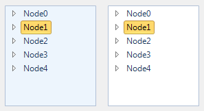
active and inactive states. Figure 2 shows an example of the Ribbon style with
the AlwaysActive property defined as False. The left instance does not have
the mouse over it and the right instance does.

Figure 2 – InputControlStyle - Ribbon
KryptonTreeNode
You can add standard TreeNode instances to the node hierarchy and it will use
the Text property to recover the text for display. Alternatively you can add
KryptonTreeNode instances that derive from that standard TreeNode class and
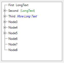
add an additional LongText property for display to the right of the standard
node text. Figure 3 shows an example with several instances of this class added
to the root Nodes collection.

Figure 3 – Nodes collection containing KryptonTreeNode instances