KryptonMonthCalendar
The KryptonMonthCalendar control presents an intuitive graphical interface for users to view and set date information. The control displays a grid containing the numbered days of the month, arranged in columns underneath the days of the week. You can select a different month by clicking the arrow buttons on either side of the month caption. This control uses the Krypton palette to obtain values for the drawing of the control.
Appearance
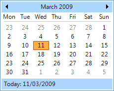
The calendar displays with a border that contains a top and bottom caption with the numbered days in the center as can be seen in figure 1. The top caption is used to display the month and year of the date displayed along with arrows that can be used to navigate forward and backward a month at a time. At the bottom is a caption area that shows today's date which acts as a button so that pressing the date will shift the selection to the date displayed. In the center are six rows of days that display the possible days that can be selected. Note that days that are not part of the month are shown in a disabled color.

Figure 1 – Office 2007 Blue Palette
Seven States
There are seven state properties that can be used to modify the appearance for different elements of the control for the different possible display states. The control background, control border and day heading elements can be customized by using the StateNormal and StateDisabled set of properties. Individual numbered days can be customized using all seven sets of properties StateNormal, StateDisabled, StateTracking, StatePressed, StateCheckedNormal, StateCheckedTracking and StateCheckedPressed. The checked group of states are used for a day this is currently part of the selection. Tracking and Pressed states represent when the mouse is hovering over the day or when the left mouse button is pressed down for the day respectively.
To speed up the customization process an extra StateCommon property has been provided. The settings from this are used if no override has been defined for the state specific entry. Note that the specific state values always take precedence and so if you define the border color in StateNormal and StateCommon then the StateNormal value will be used whenever the control is in the Normal state. Only if the StateNormal value is not overridden will it look in StateCommon.
Three Overrides
Override properties are used when a particular condition has been met and are used in preference to the State property that would normally be used. The OverrideFocus values are used if the control currently has focus allows you to specify how to modify the appearance of a numbered day when it has focus. By default the focus override only alters the appearance so that a focus rectangle is drawn around the numbered day so that the user can see that the control currently has the focus.
The OverrideBolded is used for a numbered day that needs to be more prominent because that day has been specified by the AnnuallyBoldedDates, MonthlyBoldedDates or BoldedDates collection properties. As the name suggests, by default a matching day will be shown in bold instead of the regular font. But you can modify the OverrideBolded settings to change the feedback and provide a different background or foreground color instead.
Finally the OverrideToday is used to alter the appearance of the day that is defined as today's date. You can change TodayDate property if you need to specify a particular date as today. By default the control will draw the border of the numbered date that matches TodayDate in a different color. Figure 1 shows an example where the day has a dark red border color.
ButtonSpecs
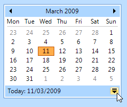
Use this collection property to define any number of extra buttons that you would like to appear at the near or far edges of the bottom caption. Figure 2 shows an example of a button specification that has been created to be positioned at the Far edge with a button style of ButtonSpec and a button type of Context. You could then use this button to show a context menu with additional options relevant to the calendar. Other possible uses of button specifications might be to indicate error conditions or to initiate the showing of help information.

Figure 2 – KryptonMonthCalendar with ButtonSpec definition
AllowButtonSpecTooltips
By default the control will not show any tool tips when you hover the mouse over
the user defined button specifications. If you set this boolean property to
True then it will turn on tool tips for those button specs. Use the
ButtonSpec.TooltipText property in order to define the string you would like
to appear inside the displayed tool tip.
AllowButtonSpecTooltipPriority
If the parent Item has tooltips, and the button spec has tooltips, then
the default is show both when hovering over the buttonspec. This can be disabled
by setting AllowButtonSpecTooltipPriority to true, so that only 1 tooltip is
displayed when hovering over any part of the control.
DataBinding
There are three properties that make good candidates for data binding against. The first is called SelectionRange and is named the same as the property found on the standard windows MonthCalendar control. Unfortunately this is hard to use because it consists of two child values for the start and end of the range. Instead we recommend that you actually bind against the SelectionStart and SelectionEnd properties. These are both of type DateTime and are simple to bind against.