KryptonGroup
Use the KryptonGroup control when you need to group related controls together. For example, you can use groups to subdivide a form into distinct areas. Moving the group will cause all the contained controls to also be moved along with it as it acts as a container. This control is similar to the KryptonPanel except it provides a border as well as a background.
The KryptonPanel is more suited towards providing the background for large sections of the client area. KryptonGroup is more suitable for grouping a small number of related controls together.
Appearance
The GroupBackStyle and GroupBorderStyle properties are used to define the top level styling required for the appearance of the KryptonGroup control. The default value of ControlClient for both properties gives an appearance appropriate for grouping together related controls. Alternatively use the ControlAlternate setting for a group that needs to stand out. There is also a custom style that can be defined via a KryptonPalette for situations where you need to create a variation on the styles already provided. The custom style is called simply Custom1.
Two States
Only two possible states of Disabled and Normal are used by the group control. In order to customize the appearance use the corresponding StateDisabled and StateNormal properties. Note that only the background and border characteristics can be modified as the group control never has a content value.
To speed up the customization process an extra StateCommon property has been provided. The settings from this are used if no override has been defined for the state specific entry. Note that the specific state values always take precedence and so if you define the background color in StateNormal and StateCommon then the StateNormal value will be used whenever the control is in the Normal state. Only if the StateNormal value is not overridden will it look in StateCommon.
Examples of Appearance
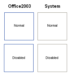
Figure 1 shows the appearance when GroupBackStyle and GroupBorderStyle are both defined as the default Control1. You can see that the Disabled and Normal states have the same appearance. If you need to show the group is disabled then you can alter the StateDisabled property as required.

Figure 1 – KryptonGroup examples