KryptonForm
The KryptonForm derives from Form and is intended as the base class for all your application Form instances. So instead of inheriting your window classes from Form you should always inherit from KryptonForm. The purpose of the KryptonForm is to perform custom chrome painting so that the border and caption areas of the form are drawn according to the defined palette settings. This ensures that your whole application has a consistent look and feel that extends to the windows themselves as well as the regular Krypton controls.
Appearance
The GroupBackStyle and GroupBorderStyle properties are used to define the border areas of the custom chrome drawing. The default value for both of these properties is FormMain. The HeaderStyle property is used to define the appearance of the caption area of the custom chrome, it has a default value of Form.
Two States
Only two possible states of Active and Inactive are used by the KryptonForm control. In order to customize the appearance use the corresponding StateActive and StateInactive properties. So if you wanted the custom chrome to have a red border when active but a blue border when inactive you would alter these two states respectively to achieve that customization.
To speed up the customization process an extra StateCommon property has been provided. The settings from this are used if no override has been defined for the state specific entry. Note that the specific state values always take precedence and so if you define the border color in StateActive and StateCommon then the StateActive value will be used whenever the control is in the Active state. Only if the StateActive value is not overridden will it look in StateCommon.
AllowFormChrome
The default value for this property is True and indicates that the form is allowed to have custom chrome painting if all other criteria are matched. Other criteria include the KryptonManager.GlobalAllowFormChrome being set to True as well as the palette being used for drawing having an AllowFormChrome setting of True. So you will only have custom chrome is the form, palette and global manager allowed it to be used.
If you set this property to False then the form will not perform custom painting of borders and caption area no matter what the global manager and palette might request. When custom chrome is not applied then the window shows a standard appearance appropriate for the operating system.
AllowStatusStripMerge
In order to achieve a professional looking appearance it is possible to request that the status strip of the form be merged into the border area. This gives an integrated look can be observed with many of the Office 2007 applications. To prevent status strip merging just set this property to False. When defined as True, the default, there are several criteria that must be met before status strip merging will occur.
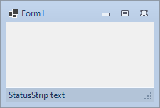
First of all the form can only merge an instance of the StatusStrip control into the border, the older StatusBar cannot be merged nor any custom control that you have created. Second the StatusStrip must be visible and have a Dock value of DockStyle.Bottom, thus showing the control is intended to be at the bottom of the form and sized to fill the entire width of the client area. Last of all the StatusStrip must be using a RenderMode setting of ToolStripRenderMode.ManagerRenderMode. Only if all these criteria are met will the control be considered for merging. Figure 1 shows an example of a status strip merged and not merged so you can see the visual difference.


Figure 1 - StatusStripMerging = True & False
AllowButtonSpecTooltips
By default the control will not show any tool tips when you hover the mouse over
the user defined button specifications. If you set this boolean property to
True then it will turn on tool tips for those button specs. Use the
ButtonSpec.TooltipText property in order to define the string you would like
to appear inside the displayed tool tip.
ButtonSpecs
You can add buttons to the caption area by modifying the ButtonSpecs
collection exposed by the KryptonForm. Each ButtonSpec entry in the
collection describes a single button for display on the header. You can use the
ButtonSpec to control all aspects of the displayed button including
visibility, edge, image, text and more. At design time use the collection editor
for the ButtonSpecs property in order to modify the collection and modify
individual ButtonSpec instances. See the ButtonSpec section for
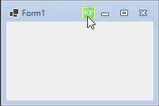
more details. Figure 2 shows an example of a KryptonForm with an extra button.

Figure 2 – KryptonForm with extra ButtonSpec
Caption Values
You can specify three values that are then displayed inside the caption
area. Two of these are existing properties of the form, Text and Icon. The
third property is a new one called ExtraText and allows an additional string
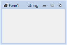
to be specified and displayed. Figure 3 shows the result of defining a value for
this ExtraText property.

Figure 3 – ExtraText = "String"
Blur Values You can specify four values to blur the form when inactive. To enable this functionality, you will need to set both BlurWhenFocusLost & EnableBlur properties to true under BlurValues. The Opacity property allows you to set how much 'blur' is applied to the source form, and the Radius property allows you to set the gausian pixel radius used to blur each pixel.

Figure 4 – Example of blur in action