KryptonColorButton
This button allows the user to select a color value. It provides feedback by drawing the currently selected color as part of the image portion of the button contents and when pressed displays a context menu that allows the user to pick a new color value. It generates the SelectedColorChanged event whenever the user picks a new color. The TrackColor is fired when the context menu is being displayed and the user tracks over different color options, allowing the application to provide instant feedback during the color selection process. Hook into the MoreColors event if you need to provide your own custom dialog for selecting extra colors that are not displayed in the context menu.
The implementation actually provides all the functionality of the KryptonDropButton but with the extra events and properties needed to provide color selection capabilities. It is therefore recommended you read the documentation for the drop button. Note that the KryptonContextMenu property is not present on this control because it is managed by the color button and not provided by the developer. You can customize the contents of the displayed context menu by intercepting the DropDown event and then modifying the provided context menu before returning.
Appearance
Define the current color by using the SelectedColor property. This color will then be displayed in a rectangle that overlays the image portion of the button contents. The first three images of figure 1 show the display with Red, Green and Blue as the respective selected color. If the Empty value is selected then instead of drawing as a solid block only the border around the block is drawn in the EmptyBorderColor setting. This can be seen as the bottom image in figure 1. This makes sense because drawing the Empty color would result in nothing being drawn and so to ensure some feedback is presented to the user only the border of the rectangle is drawn. Change EmptyBorderColor if the default dark gray is not appropriate as the empty border.
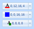
By default the color block is drawn at the bottom of the image area. You can use the SelectedRect property to change this setting to something that matches the image you have decided to show. Figure 2 shows the default setting at the top following by two custom rectangles.
**Important: **If you don't provide an image for the content then you will not get the selected color displayed!

Figure 1 – SelectedColor and EmptyBorderColor Properties

Figure 2 – SelectedRect Property
Behaviour
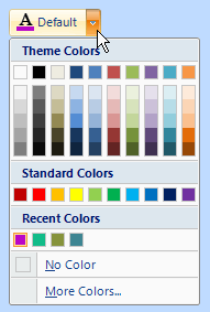
Figure 3 shows the context menu used with the default settings applied. This section describes how to use the various behavior properties to modify the contents and operation of the color button and the context menu. The five areas of the context menu, from top to bottom, are Themes, Standard, Recent, NoColor and MoreColors. Each of these areas can be turned off by using the associated visible property. So define VisibleThemes to be False in order to remove the display of the theme colors section at the top of the context menu. Remove the No Color option by setting VisibleNoColor to False, something you might want to do if your application needs to ensure a drawable color is always defined.

Figure 3 – Displayed Context Menu
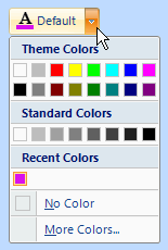
In order to change the set of colors shown within the Themes and Standard areas you can modify the SchemeThemes and SchemeStandard properties, figure 4 shows these defined as Basic16 and Mono8 respectively. To alter the title strings above the color blocks you expand the Strings compound property at design time and then alter the appropriate properties as required.

Figure 4 – Modified SchemeThemes and SchemeStandard
The purpose of the Recent section of the menu is two fold. First of all it provides a place for displaying the selected color if that color is not present in the two scheme areas above. This can happen if the user selects the More Colors option and uses it to find an unusual color. It also provides a memory of recent selections (that are not part of the schemes areas) so the user can pick a color that was recently used. Use the MaxRecentColors property to define the maximum number of color entries in this area. Any additional recent colors above this number are discarded. If you do not want the contents of the recent colors area automatically updated as selection changes occur then set the AutoRecentColors property to False.
Customizing the Context Menu
To alter the contents of the drop down context menu you need to hook into the DropDown event. This event provides a reference to the KryptonContextMenu instance that is about to be shown. Update this instance by adding your own context menu entries as required. Note that the next time this event is called the changes will still be present. You should remove the display of standard items by setting the appropriate visible property to false rather than removing it from the actual context menu instance.
Four States
The button can be in one of four possible states, Disabled, Normal, Tracking and Pressed. If the control has been disabled because the Enabled property is defined as False then the button will be in the Disabled state.
When enabled the button will be in the Normal state until the user moves the mouse over the button at which point it enters the Tracking state. If the user presses the left mouse button whilst over the control then it enters the Pressed state. Note that if you have defined the drop down to be a Splitter then the two portions of the button can be in different states. For example, whilst the mouse is pressed over the drop arrow area that area will be shown in the Pressed state but the remainder will be drawn in the Tracking state.
In order to customize the appearance of the control in each of the four states you can use the properties StateDisabled, StateNormal, StateTracking and StatePressed. Each of these properties allows you to modify the background, border and content characteristics.
Common State
To speed up the customization process an extra StateCommon property has been provided. The settings from this are used if no override has been defined for the state specific entry. Note that the specific state values always take precedence and so if you define the border width in StateNormal and StateCommon then the StateNormal value will be used whenever the control is in the Normal state. Only if the StateNormal value is not overridden will it look in StateCommon.
Imagine the following scenario; you would like to define the border of the button to be 3 pixels wide with a rounding of 2 pixels and always red. Without the StateCommon property you would need to update the same three border settings in each of StateDisabled, StateNormal, StateTracking and StatePressed properties. Instead you can define the three border settings in just StateCommon and know they will be used whichever of the four appearance states the button happens to be using.
State Overrides
There are two additional properties called OverrideDefault and OverrideFocus that are involved in altering the appearance of the control. Notice that these start with the Override prefix instead of the usual State. This is because they do not relate to a specific control state such as Normal or Tracking. Instead they can be applied to any of the four possible states and are used to override the appearance that would otherwise be shown.
Focus Override
If the control currently has the focus then the OverrideFocus settings are applied. This can occur when the control is in Normal, Tracking or Pressed states. By default the override only alters the appearance so that a focus rectangle is drawn around the content so that the user can see that the control currently has the focus.
Default Button Override
Each Form has the concept of a default button that is clicked when the user presses the Enter key. The KryptonButton also supports the default button mechanism and OverrideDefault settings are applied to the appearance whenever the control has been designated as the default.
Examples of Appearance
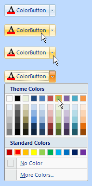
Figure 5 shows the appearance of different states. The top example shows the color button without any mouse interaction. The second and third images show the mouse tracking over the two areas of the control and the last image shows the context menu displayed when the drop arrow is pressed.

Figure 5 – DropDown Appearance