KryptonBorderEdge
Use the KryptonBorderEdge control when you need to display a vertical or horizontal graphic that has a border appearance. For example, you could place a vertical KryptonBorderEdge instance inside a KryptonGroup in order to split the group into two visual areas. Using this control would ensure the appearance of the vertical graphic is consistent with the appearance of the KryptonGroup border. They would have the same colors and thickness etc.
Appearance
The BorderStyle property is used to define the styling required for the appearance of the KryptonBorderEdge control. The default value of Control - Client is the same as the default border style of the KryptonGroup. You can alter this property to any of the many border style enumeration values so that the appearance matches whatever control you are using.
You can use the Orientation property to specify either a vertical or horizontal. By default the control has an AutoSize value of True that will cause one of the control dimensions to be automatically calculated. When in the vertical orientation the width is automatically calculated and when horizontal the height is auto calculated. If you need to specify both the width and height then set the AutoSize to be False. See figure 1 for examples of both orientations.

Figure 1 – Width = 5, Orientation = Horizontal + Vertical
Two States
Only two possible states of Disabled and Normal are used by the border edge control. In order to customize the appearance use the corresponding StateDisabled and StateNormal properties.
To speed up the customization process an extra StateCommon property has been provided. The settings from this are used if no override has been defined for the state specific entry. Note that the specific state values always take precedence and so if you define the border width in StateNormal and StateCommon then the StateNormal value will be used whenever the control is in the Normal state. Only if the StateNormal value is not overridden will it look in StateCommon.
Examples of Appearance
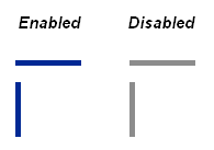
Figure 2 shows the appearance of the border edge for the Control - Client style in the vertical and horizontal orientations. The left side shows the controls enabled and the right side shows the disabled appearance.

Figure 2 – Example appearance