Tutorial – Expanding HeaderGroups (Splitters)
Part 1 - Expanding/Collapsing Left Panel
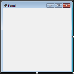
1) Create a new Windows Forms project
This will automatically create a form in design mode as below.
2) Add a reference to the Krypton.Toolkit assembly
C# : Right click the 'References' group in your project and select the 'Add Reference...' option. Use the 'Browse' tab of the shown dialog box to navigate to the location you installed the library and choose the '\bin\Krypton.Toolkit.dll' file. This will then add the toolkit assembly to the list of references for the project.
VB.NET : Right click the project in the 'Solution Explorer' window and choose the 'Add Reference' option. Use the 'Browse' tab of the shown dialog box to navigate to the location you installed the library and choose the '\bin\Krypton.Toolkit.dll' file. This will then add the toolkit assembly to the list of references for the project.
3) Ensure that the Krypton Toolkit components are in the Toolbox
If not the Using Krypton in Visual Studio 2022
tutorial can be used to add them.
4) Open the code view for the form and change the base class.
Change the base class from the default of 'Form' to be 'Krypton.Toolkit.KryptonForm'. Your new definition for C# would be: -
public partial class Form1 : KryptonForm
If using VB.NET then your new definition should like this: -
Partial Class Form1
    Inherits Krypton.Toolkit.KryptonForm
Recompile the project and then show the form in design mode again, this time you should see custom chrome applied to the form.
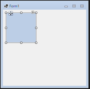
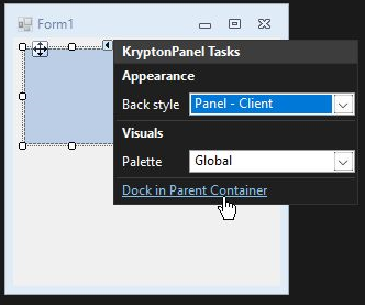
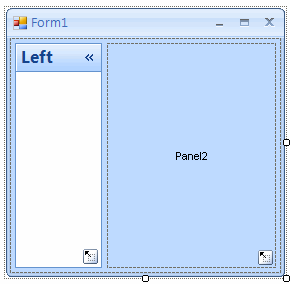
5) Drag a KryptonPanel from the toolbox and drop it in the centre of the form
When dropped it should look like the following picture.
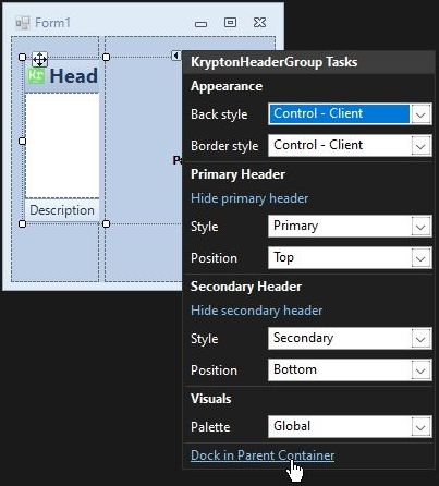
6) Use the KryptonPanel smart tag and click ‘Dock in parent container’
The panel will now occupy the entire client area even when the form is resized.
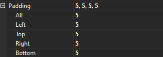
7) Modify the Padding property for the new KryptonPanel to 5 on all sides
We need to add padding because another control will be placed inside and we want a nice border around the contained control.
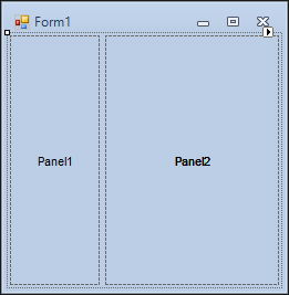
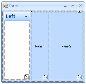
8) Drag a KryptonSplitContainer from the toolbox and drop it inside the KryptonPanel
You should see text indicating the position of Panel1 and Panel2 areas.
9) Drag a KryptonHeaderGroup from the toolbox and drop it inside Panel1
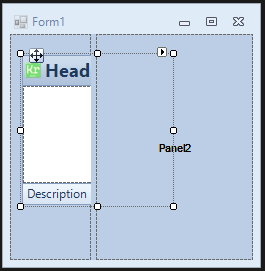
10) Use the KryptonHeaderGroup smart tag and click ‘Dock in parent container’
The panel will now occupy the entire client area of Panel1.
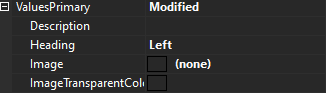
11) Modify the KryptonHeaderGroup 'Text' and 'Image' properties
Use the properties window to find the 'ValuesPrimary' property and then set the
'Text' to 'Left' and remove the 'Image' value.
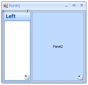
12) Modify the KryptonHeaderGroup 'HeaderVisibleSecondary' property to
'False'
This will remove from display the second header and leave the display as
follows.
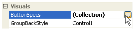
13) Find the 'ButtonSpecs' property and click the ellipses button
We we will use the collection property to define the header buttons.
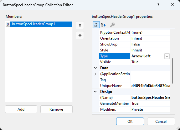
14) Add one instance to the collection and set the 'Type' to 'Arrow Left'
Use the 'Add' button on the collection editor to add a new
ButtonSpec entry. Then set the 'Type' property of the entry to be 'Arrow Left'
so that the palette provided image will be shown. It should look like this in
the dialog box, then press the 'OK' button.
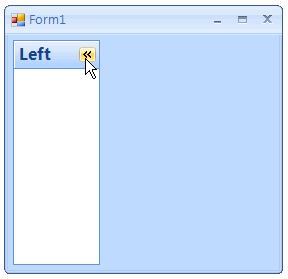
15) Initial setup of Left group is completed
You should now see the following picture as the initial display for the left
group.
16) Enter code view and add the following using statement
This is needed to ensure that the rest of the code will compile.
using Krypton.Toolkit;
17) Hook into the header button click event
Modify the constructor for the form with the following code in order to be
notified when the user clicks the header button.
public Form1()
{
   InitializeComponent();

   // Hook into the click events on the header buttons
   kryptonHeaderGroup1.ButtonSpecs[0].Click += new EventHandler(OnLeftRight);
}
18) Add private field for remembering header width
Add the following private field to the form class.
private int _widthLeftRight;
19) Add button click handler code
Add the following event handler to the form class.
A description of how the code works follows after the code.
private void OnLeftRight(object sender, EventArgs e)
{
   // (1) Suspend changes until all splitter properties have been updated
   kryptonSplitContainer1.SuspendLayout();

   // (2) Is the left header group currently expanded?
   if (kryptonSplitContainer1.FixedPanel == FixedPanel.None)
   {
      // (3) Make the left panel fixed in size
      kryptonSplitContainer1.FixedPanel = FixedPanel.Panel1;
      kryptonSplitContainer1.IsSplitterFixed = true;

// (4) Remember the current height of the header group
_widthLeftRight = kryptonHeaderGroup1.Width;

// (5) Find the new width to use for the header group
int newWidth = kryptonHeaderGroup1.PreferredSize.Height;

// (6) Make the header group fixed just as the new height
kryptonSplitContainer1.Panel1MinSize = newWidth;
kryptonSplitContainer1.SplitterDistance = newWidth;

// (7) Change header to be vertical and button to near edge
kryptonHeaderGroup1.HeaderPositionPrimary = VisualOrientation.Right;
kryptonHeaderGroup1.ButtonSpecs[0].Edge = PaletteRelativeEdgeAlign.Near;
}
else
{
// Make the bottom panel not-fixed in size anymore
kryptonSplitContainer1.FixedPanel = FixedPanel.None;
kryptonSplitContainer1.IsSplitterFixed = false;

// Put back the minimize size to the original
kryptonSplitContainer1.Panel1MinSize = 100;

// Calculate the correct splitter we want to put back
kryptonSplitContainer1.SplitterDistance = \_widthLeftRight;

// Change header to be horizontal and button to far edge
kryptonHeaderGroup1.HeaderPositionPrimary = VisualOrientation.Top;
kryptonHeaderGroup1.ButtonSpecs[0].Edge = PaletteRelativeEdgeAlign.Far;
}


kryptonSplitContainer1.ResumeLayout();

}
(1) Because we are changing several different splitter properties in one go we wrap the changes in a SuspendLayout() / ResumeLayout() pair so that the changes are not acted on until all the properties have been modified. This reduces the amount of flicker that would otherwise occur because each property change updates the appearance in turn.
(2) The code begins by checking if the header group is in the expanded or collapsed state. When expanded there will be no fixed panel because the user is allowed to move the separator to update the relative spacing of the two splitter panels.
(3) When becoming collapsed we want the splitter panel to become fixed in size and prevent the user from moving the separator. The first line of code will fix the first panel so that any resizing of the form will cause the second splitter panel to be resized and leave the first splitter panel the same constant size. The second line makes the separator read only.
(4) We need to remember the current width of the first splitter panel so that when the group is expanded again in the future we can put it back to the same size as it originally started at.
(5) Because we are going to change the header group orientation to vertical the new width of the splitter panel needs to be the height of the primary header on the header group. This height can be discovered by asking for the PreferredSize of the control now that that collapsed state has changed. The collapsed is automatically toggled because we are using an arrow button type.
(6) In order to collapse the splitter panel we need to set the new width of the first panel.
(7) Finally we change the image so that it points in the opposite direction, place it at the opposite edge of the header and change the orientation of the header to be vertical.
The 'else' section of the code is self evident once the above is understand and merely puts the header group back into the original state. At runtime the initial view of the window would be as follows.
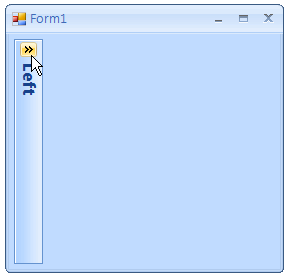
After using the header button it will then collapse down to the following.
Part 2 - Expanding/Collapsing Right Panel
20) Drag a KryptonSplitContainer from the toolbox and drop it inside the right
panel
You should see text indicating the position of new Panel1 and Panel2 areas.
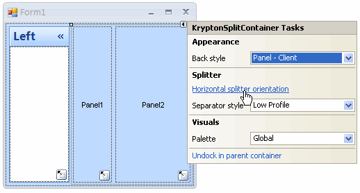
21) Use the KryptonSplitContainer smart tag and click ‘Horizontal splitter orientation'
The splitter will now change to a vertical orientation with panel1 at the top and panel2 at the bottom.
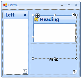
22) Drag a KryptonHeaderGroup from the toolbox and drop it inside Panel1
23) Use the KryptonHeaderGroup smart tag and click ‘Dock in parent
container'
This ensures the header group is always sized to fit the splitter panel size.
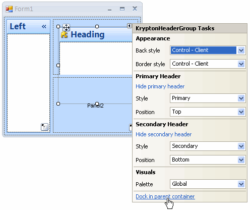
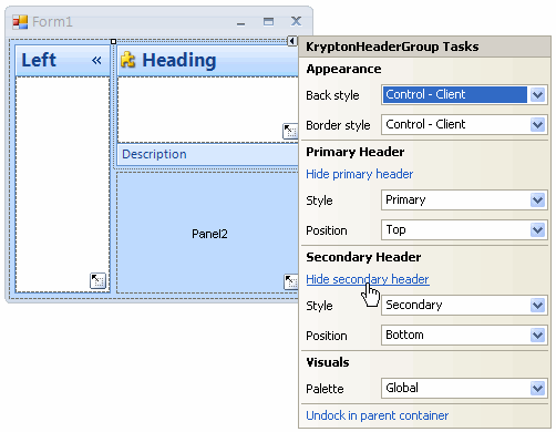
24) Use the KryptonHeaderGroup smart tag and click ‘Hide secondary header'
We don't need the secondary header at the bottom for this example application.
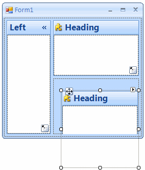
25) Drag a KryptonHeaderGroup from the toolbox and drop it inside Panel2
We now follow the same steps for the header group in the second splitter panel.
26) Use the KryptonHeaderGroup smart tag and click ‘Dock in parent container'
This ensures the header group is always sized to fit the splitter panel size.
27) Use the KryptonHeaderGroup smart tag and click ‘Hide secondary header'
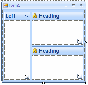
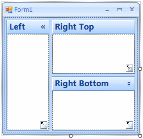
You should end up with the following arrangement.
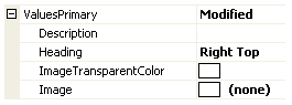
28) Modify the top right KryptonHeaderGroup 'Text' and 'Image' properties
Use the properties window to find the ValuesPrimary property and then set the
'Text' to 'Right Top' and remove the 'Image' value.
29) Modify the bottom right KryptonHeaderGroup 'Text' and 'Image' properties
Use the properties window and this time set the 'Text' to 'Right Bottom' and
remove the 'Image' value.
This should result in the following updated display.
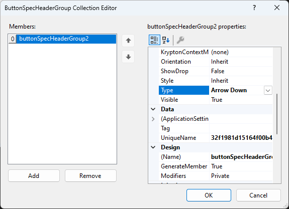
30) Find the 'ButtonSpecs' property and click the ellipses button
With the bottom right header group still selected find and click the ellipses
button for the 'ButtonSpecs' property.
31) Add one instance to the collection and set the 'Type' to 'Arrow Down'
Use the 'Add' button on the collection editor to add a new
ButtonSpec entry. Then set the 'Type' property of the entry to be 'Arrow Down'
so that the palette provided image will be shown. It should look like this in
the dialog box, then press the 'OK' button.
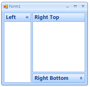
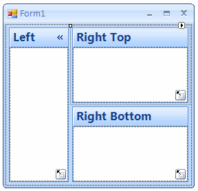
32) Initial setup of right groups is completed
You should now see the following picture as the initial display for the
application.
33) Enter code view and hook into the button click event
Modify the constructor by adding the following line.
kryptonHeaderGroup3.ButtonSpecs[0].Click += new EventHandler(OnUpDown);
34) Add private field for remembering header height
Add the following private field to the form class.
private int _heightUpDown;
35) Add button click handler code
Add the following event handler to the form class.
A description of how the code works follows after the code.
private void OnUpDown(object sender, EventArgs e)
{
   // (1) Is the bottom right header group currently expanded?
   if (kryptonSplitContainer2.FixedPanel == FixedPanel.None)
   {
      // (2) Make the bottom panel fixed in size
      kryptonSplitContainer2.FixedPanel = FixedPanel.Panel2;
      kryptonSplitContainer2.IsSplitterFixed = true;

      // (3) Remember the current height of the header group
      \_heightUpDown = kryptonHeaderGroup3.Height;

      // (4) Find the new height to use for the header group
      int newHeight = kryptonHeaderGroup3.PreferredSize.Height;

      // (5) Make the header group fixed just as the new height
      kryptonSplitContainer2.Panel2MinSize = newHeight;
      kryptonSplitContainer2.SplitterDistance = kryptonSplitContainer2.Height;
   }
   else
   {
      // Make the bottom panel not-fixed in size anymore
      kryptonSplitContainer2.FixedPanel = FixedPanel.None;
      kryptonSplitContainer2.IsSplitterFixed = false;

      // Put back the minimum size to the original
      kryptonSplitContainer2.Panel2MinSize = 100;

      // Calculate the correct splitter we want to put back
      kryptonSplitContainer2.SplitterDistance =
         kryptonSplitContainer2.Height - \_heightUpDown -
kryptonSplitContainer2.SplitterWidth;
   }
}
(1) The code begins by checking if the header group is in the expanded or collapsed state. When expanded there will be no fixed panel because the user is allowed to move the separator and so update the relative spacing of the two splitter panels.
(2) When becoming collapsed we want the splitter panel to become fixed in size and prevent the user from moving the separator. The first line of code will fix the second panel so that any resizing of the form will cause the first splitter panel to be resized and leave the second splitter panel the same constant size. The second line makes the separator read only.
(3) We need to remember the current height of the second splitter panel so that when the group is expanded again in the future we can put it back to the same size as it originally started at.
(4) The new height of the second splitter panel can be discovered by using the DisplayRectangle that represents the inside client area of the header group. This height can be discovered by asking for the PreferredSize of the control now that that collapsed state has changed. The collapsed is automatically toggled because we are using an arrow button type.
(5) In order to collapse the splitter panel we set the required height as the minimum height of the second split panel and then attempt to update the splitter distance to the whole height of the split container. The splitter distance will then we changed automatically by the split container control so that the minimum height of the second split panel is enforced.
The 'else' section of the code is self evident once the above is understand and merely puts the header group back into the original state. At runtime you should be able to press the down arrow to get the following display.