KryptonDateTimePicker
The KryptonDateTimePicker control allows the user to select a single item from a list of dates or times. When used to represent a date, it appears in two parts: a drop-down list with a date represented in text, and a grid appears when you click on the down-arrow next to the list. This control uses the Krypton palette to obtain values for the drawing of the control.
Appearance
The InputControlStyle property has a default value of Standalone giving the same appearance as seen in figure 1. As the name suggests this is intended for use in a scenario where the control is used in a standalone fashion and used on something like a KryptonPanel or KryptonGroup. The InputControlStyle of Ribbon is intended for use when the control is present inside the KryptonRibbon and then needs a different appearance and operation.
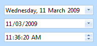
Figure 1 – InputControlStyle = Standalone
Three States
Only three possible states of Disabled, Normal or Active are used by the date time picker control. In order to customize the appearance use the corresponding StateDisabled, StateNormal and StateActive properties. Each of these properties allows you to modify the background, border and content characteristics. Note that the control is restricted to the Disabled and Active states if the AlwaysActive property is defined as True.
To speed up the customization process an extra StateCommon property has been provided. The settings from this are used if no override has been defined for the state specific entry. Note that the specific state values always take precedence and so if you define the border color in StateNormal and StateCommon then the StateNormal value will be used whenever the control is in the Normal state. Only if the StateNormal value is not overridden will it look in StateCommon.
AlwaysActive
This property is used to indicate if the control should always be in the active state. For an InputControlStyle of Standalone the default value of True is appropriate. However, when you switch to using the InputControlStyle of Ribbon you should alter this to False.* *A value of False means that when the mouse is not over the control and it also does not have focus it will be considered inactive. This allows you to specify a different appearance for the active and inactive states. Figure 2 shows an example of the Ribbon style with the AlwaysActive property defined as False. The top instance does not have the mouse over it and the bottom instance does.
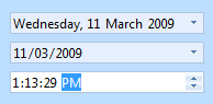
Figure 2 – InputControlStyle = Ribbon
ButtonSpecs
Use this collection property to define any number of extra buttons that you would like to appear at the near or far edges of the control. Figure 3 shows an example of a button specification that has been created to be positioned at the Far edge with a button style of ButtonSpec and a button type of Context. You could then use this button to show a context menu with additional options relevant to the entry field. Other possible uses of button specifications might be to indicate error conditions or to initiate the showing of help information.
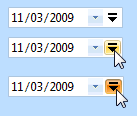
Figure 3 – KryptonDateTimePicker with ButtonSpec definition
AllowButtonSpecTooltips
By default the control will not show any tool tips when you hover the mouse over the user defined button specifications. If you set this boolean property to True then it will turn on tool tips for those button specs. Use the ButtonSpec.TooltipText property in order to define the string you would like to appear inside the displayed tool tip.
AllowButtonSpecTooltipPriority
If the parent Item has tooltips, and the button spec has tooltips, then
the default is show both when hovering over the buttonspec. This can be disabled
by setting AllowButtonSpecTooltipPriority to true, so that only 1 tooltip is
displayed when hovering over any part of the control.