Ribbon Group Item DateTimePicker
Group Item DateTimePicker
Use this element to add a date time picker control to the ribbon. The set of available properties is shown in Figure 1.
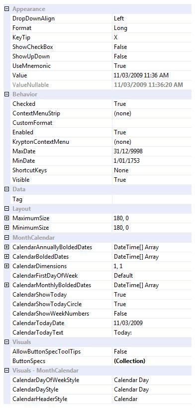
Figure 1 - Group Item DateTimePicker Properties
DropDownAlign
Determines if the drop down month calendar appears aligned to the left or right edge of the date time picker.
Format
Offers predefined ways of formatting the text portion of the control.
KeyTip
Character used to select the control when the user presses ALT to gain keyboard access to the ribbon.
ShowCheckBox
Defaults to False and so does not show a check box in the control but when defined allows the user to decide if the value in the control is valid.
ShowUpDown
Defaults to False and so shows a drop down button but when defined as True will display up/down buttons for modifying contents.
Value
A DateTime property that represents the value inside the control.
ValueNullable
A object type property that returns DBNull when the Checked property is False but a valid DateTime when the Checked property is True.
Checked
When defined the value of the control is valid, otherwise the value is not valid and drawn disabled.
CustomFormat
If the Format property is defined as Custom then this property defines how the text is formatted.
CustomNullText
If the Checked property is False then this text is drawn in the text area unless the property is set to an empty string.
Enabled
Should the month calendar be displayed as enabled and allow interaction with the user. Note that if the KryptonContextMenu component has its own Enabled property defined as False then the item will be disabled regardless of the individual menu item Enabled state.
MaxDate
MinDate
Place limits on the displayed and selectable date range by using these two properties.
Visible
Define this as False if you do not want the element to be displayed.
ShortcutKeys
Define this property if you would like your application to have a shortcut key combination that invokes the date time picker.
Tag
Use the Tag to assign your application specific information with the component instance.
MaximumSize
MinimumSize
These two properties are very important and allow you to control the width of the date time picker. By default they have the same value giving a fixed width to the control, but you can alter the values so that they specify a valid range of widths. When the control is positioned it is asked for its preferred size which is then constrained by these two properties.
CalendarAnnuallyBoldedDates
CalendarMonthlyBoldedDates
CalendarBoldedDates
Use these collections to specify which dates should be displayed in a bold state.
CalendarDimensions
Determines the number of months shown as a grid.
CalendarFirstDayOfWeek
Specify which day of week is used as the first displayed column within the month.
CalendarShowToday
CalendarShowTodayCircle
Determines if today's date is displayed in the bottom caption of the control and if the day that represents today's date has a highlighted border (circle).
CalendarShowWeekNumbers
When defined this property will show week numbers in the row header of each displayed week of values.
CalendarTodayDate
Defaults to the current date when the control is created but can be set to define any date as the today date.
CalendarTodayText
Text used to caption the today's date in the bottom caption area.
AllowButtonSpecTooltips
By default the control will not show any tool tips when you hover the mouse over the user defined button specifications. If you set this boolean property to True then it will turn on tool tips for those button specs. Use the ButtonSpec.TooltipText property in order to define the string you would like to appear inside the displayed tool tip.
ButtonSpecs
Use this collection property to define any number of extra buttons that you would like to appear at the near or far edges of the control.
CalendarDayOfWeekStyle
CalendarDayStyle
CalendarHeaderStyle
Properties used to define the palette styles used to draw various elements of the control.