Ribbon Group Item CheckBox
Group Item CheckBox
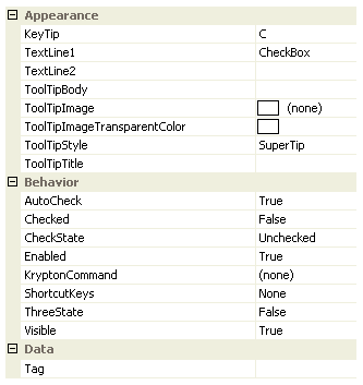
You can add a check box to either the group triple or the group lines container. Use the CheckState property to define the checked state of the check box. Figure 1 shows the list of all properties exposed by the group check box item.

Figure 1 - Group Item CheckBox Properties
KeyTip
When KeyTips are displayed this property defines the KeyTip for the check button instance. You should ensure that all items inside a tab have unique KeyTip values so that the user can always select items using keyboard access.
TextLine1
TextLine2
When the check box is inside a container that displays it the full height of the group content area the TextLine1 and TextLine2 strings are shown on two separate lines underneath the check box image. In all other cases the TextLine1 and TextLine2 are concatenated together with a space between them for showing horizontally after the check box image.
ToolTipBody
ToolTipImage
ToolTipImageTransparentColor
ToolTipStyle
ToolTipTitle
When the user hovers the mouse over the check box instance you can use these properties to define the tool tip that will be displayed. Use ToolTipTitle and ToolTipBody to define the two text strings for display and ToolTipImage for the associated image. If you image contains a color that you would like to be treated as transparent then set the ToolTipImageTransparentColor. For example, many bitmaps use magenta as the color to become transparent. To control how the text and image are displayed in the tool tip you can use the ToolTipStyle property.
AutoCheck
When defined as True this property will allow the user to changed the check state by using the mouse to click the control instance.
Checked
A boolean property this indicates if the check box is currently checked or not. If you require a three state use of the check box then you should use the CheckState property as that allows an intermediate state to be defined. For regular use as either a checked or not checked state control then you can use this Checked property.
CheckState
Use this property to define one of the three possible display states of the check box. The available states are Checked, Unchecked or Indeterminate. The checked state will result in a tick appearing inside the check box, the unchecked state shows just an empty check box and the indeterminate state a square inside the check box.
Enabled
Used to define if the check box is enabled or disabled at runtime.
KryptonCommand
Attached command that is used as a source of state.
ShortcutKeys
Define this property if you would like your application to have a shortcut key combination that invokes the check box.
ThreeState
Should selecting the control rotate around the three possible states or should it rotate around just the checked/unchecked state.
Visible
Use this property to specify if the check box should be visible at runtime.
Tag
Associate application specific information with the object instance by using this property.
Events
Click
Occurs when the check box has been pressed.
CheckedChanged
Occurs when the Checked property changes value.
CheckStateChanged
Occurs when the CheckState property changes value.