Ribbon Group Item NumericUpDown
Group Item NumericUpDown
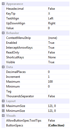
Use this element to add a numeric up down control to the ribbon. The set of available properties is shown in Figure 1.

Figure 1 - Group Item NumericUpDown Properties
Hexadecimal
Determines if the numeric is display in hex (base 16) format or in the usual decimal (base 10) format.
KeyTip
When KeyTips are displayed this property defines the KeyTip for the custom control instance. You should ensure that all items inside a tab have unique KeyTip values so that the user can always select items using keyboard access.
TextAlign
Defines the alignment of the numeric value which can be either left, centered or the right.
UpDownAlign
Should the up-down spin buttons be placed to the right or left of the edit box.
Value
The current decimal value as entered by the user into the edit box.
ContextMenuStrip
Reference to menu strip associated with the control instance.
Enabled
Used to define if the text box is enabled or disabled at runtime.
InterceptArrowKeys
True if you want the numeric control to use the up and down arrow keys to modify the edit value.
ReadOnly
Should the value be presented as read only for the user.
ShortcutKeys
Define this property if you would like your application to have a shortcut key combination that sets focus to the numeric.
Visible
Use this property to specify if the text box should be visible at runtime.
DecimalPlaces
How many digits should be displayed after the decimal place.
Increment
The decimal value to add or subtract when the user presses the spin buttons or up and down arrow keys.
Maximum
The upper limit allowed for the value of the numeric.
Minimum
The lower limit allowed for the value of the numeric.
Tag
Associate application specific information with the object instance by using this property.
ThousandsSeparator
When defined the culture specific thousands separator will be shown between each group of three digits.
MaximumSize
MinimumSize
These two properties are very important and allow you to control the width of the combo box. By default they have the same value giving a fixed width to the control, but you can alter the values so that they specify a valid range of widths. When the control is positioned it is asked for its preferred size which is then constrained by these two properties.
AllowButtonSpecTooltips
By default the text box will not show any tool tips when you hover the mouse over the user defined button specifications. If you set this boolean property to True then it will turn on tool tips for those button specs. Use the ButtonSpec.TooltipText property in order to define the string you would like to appear inside the displayed tool tip.
ButtonSpecs
You can add extra buttons to the text box by modifying the ButtonSpecs collection. Each ButtonSpec entry in the collection describes a single button for display. You can use the ButtonSpec to control all aspects of the displayed button including visibility, edge, image, text and more. At design time use the collection editor for the ButtonSpecs property in order to modify the collection and modify individual ButtonSpec instances.
Hidden Property
In order to gain access to the underlying KryptonNumericUpDown instance you can use the hidden property called NumericUpDown. This is not displayed at design time and not persisted but can be accessed via code at runtime. This is useful if you need to access a property that is not exposed via this ribbon element.