Ribbon Group Item Label
Group Item Label
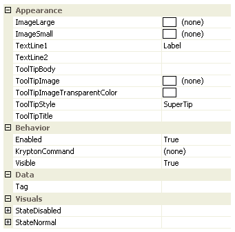
The label item can be added to a group triple or a group lines container. Use this item when you need to present static information or to label another item that is adjacent. Figure 1 shows the list of all properties exposed by the item label instance.

Figure 1 - Group Item Label Properties
ImageLarge
ImageSmall
By default the label item does not show any images. If you need an image shown when the label is the full height of the group content area then use the ImageLarge property. All other cases use the ImageSmall if it has been specified.
TextLine1
TextLine2
When the label is inside a container that displays it the full height of the group content area the TextLine1 and TextLine2 strings are shown on two separate lines underneath the ImageLarge. In all other cases the TextLine1 and TextLine2 are concatenated together with a space between them for showing horizontally after the ImageSmall.
ToolTipBody
ToolTipImage
ToolTipImageTransparentColor
ToolTipStyle
ToolTipTitle
When the user hovers the mouse over the label instance you can use these properties to define the tool tip that will be displayed. Use ToolTipTitle and ToolTipBody to define the two text strings for display and ToolTipImage for the associated image. If you image contains a color that you would like to be treated as transparent then set the ToolTipImageTransparentColor. For example, many bitmaps use magenta as the color to become transparent. To control how the text and image are displayed in the tool tip you can use the ToolTipStyle property.
Enabled
Used to define if the label is enabled or disabled at runtime.
KryptonCommand
Attached command that is used as a source of state.
Visible
Use this property to specify if the label should be visible at runtime.
StateDisabled
StateNormal
You can modify the colors used for drawing the label text by using these properties. All other types of item and container cannot be customized on a per instance basis. However, the label has the extra customization ability because it allows state information to be related to the user more effectively. For example, you might set text color to green when your application is working correctly and then change the text to red when a problem occurs.
Tag
Associate application specific information with the object instance by using this property.