Ribbon Group Item ComboBox
Group Item ComboBox
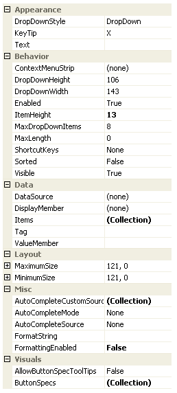
Use this element to add combo box control to the ribbon. The set of available properties is shown in Figure 1.

Figure 1 - Group Item ComboBox Properties
KeyTip
When KeyTips are displayed this property defines the KeyTip for the custom control instance. You should ensure that all items inside a tab have unique KeyTip values so that the user can always select items using keyboard access.
Enabled
Used to define if the combo box is enabled or disabled at runtime.
ShortcutKeys
Define this property if you would like your application to have a shortcut key combination that sets focus to the combo box.
Visible
Use this property to specify if the combo box should be visible at runtime.
MaximumSize
MinimumSize
These two properties are very important and allow you to control the width of the combo box. By default they have the same value giving a fixed width to the control, but you can alter the values so that they specify a valid range of widths. When the control is positioned it is asked for its preferred size which is then constrained by these two properties.
ButtonSpecs
You can add extra buttons to the combo box by modifying the ButtonSpecs collection. Each ButtonSpec entry in the collection describes a single button for display. You can use the ButtonSpec to control all aspects of the displayed button including visibility, edge, image, text and more. At design time use the collection editor for the ButtonSpecs property in order to modify the collection and modify individual ButtonSpec instances.
AllowButtonSpecTooltips
By default the combo box will not show any tool tips when you hover the mouse over the user defined button specifications. If you set this boolean property to True then it will turn on tool tips for those button specs. Use the ButtonSpec.TooltipText property in order to define the string you would like to appear inside the displayed tool tip.
Tag
Associate application specific information with the object instance by using this property.
Other Properties
All the other properties displayed in Figure 5 are just properties from the underlying KryptonComboBox instance and exposed via this element for ease of access. For more information about these properties see the standard windows documentation for the ComboBox control.
Hidden Property
In order to gain access to the underlying KryptonComboBox instance you can use the hidden property called ComboBox. This is not displayed at design time and not persisted but can be accessed via code at runtime. This is useful if you need to access a property that is not exposed via this ribbon element.