Content
Content
Content always consists of two text values and one set of image details. All of these are optional so you can choose to provide none, one, two or all three properties as needed. They are grouped together, for example the KryptonButton provides a property called Values that contains the values as child properties. See Figure 1 for an example of the property window for a KryptonButton.
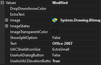
Figure 1 – KryptonButton values property
The exact name of the properties varies depending on the context in which the content is being used. The KryptonButton calls them Text, ExtraText, Image, ImageStates and ImageTransparentColor whereas the KryptonHeader uses the names Header and Description instead of Text and ExtraText. We will call them ShortText, LongText, Image, ImageStates and ImageTransparentColor for the duration of this section.
Any control that provides content values will also allow you to specify how the content is displayed for each of the control states. Figure 2 shows the set of properties available for controlling the display of the content values.
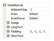
Figure 2 – Content display settings
Content Properties
AdjacentGap controls the pixel spacing between the different content values. Use this to change the distance between the ShortText, LongText and Image. Figure 3 shows a KryptonLabel with values of 1, 5 and 20 respectively.
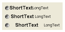
Figure 3 – AdjacentGap property
Draw is used to determine if any of the content should be displayed. When defined as False the content is ignored completely. DrawFocus indicates if a focus rectangle should be drawn around the edge of the content area. Figure 4 shows a KryptonLabel control with the DrawFocus defined as False and True respectively.

Figure 4 – DrawFocus property
Padding specifies how far to inset the content from the outside of the control. You can provide a value that is the same for all the sides or individual values for each of the edges. Figure 5 uses a KryptonButton control that is auto sized to demonstrate how padding values affect the size and drawing of the control.
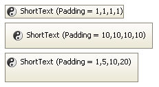
Figure 5 – Padding property
The remaining three properties are Image, ShortText and LongText that contain settings that affect just the corresponding parts of the content.
Positioning
Each of the three content parts has a property for controlling the horizontal alignment and another for the vertical alignment. These are called ImageH, ImageV for the Image and TextH, TextV for the ShortText and LongText. All of them have the same possible set of values Inherit, Near, Center and Far.
Inherit is used to indicate that the value of the property should be determined by looking higher up the inheritance chain. On a left to right system the Near, Center and Far are interpreted as Left/Top, Middle and Right/Bottom. Right to left systems will interpret this in the reverse order of Right/Bottom, Middle and Left/Top.
Positioning is easiest to understand by using examples. In Figure 6 a sequence of images shows the ShortText positioned inside a fixed size KryptonButton. In each case the actual display text is the horizontal and vertical alignment values.
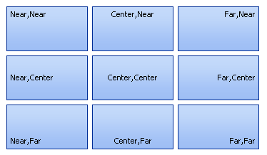
Figure 6 – TextH, TextV positioning of ShortText only
If you position more than one of the content elements in the same place then they simply concatenate together in the order of Image, ShortText and LongText. So if all three were positioned at (Far, Far) then you would get the situation shown in Figure 7. Note that the Image is positioned first and so takes the furthest position horizontally. Then the ShortText is added and finally the LongText.

Figure 7 – Far, Far positioning of all content
You can achieve most affects you will need by using these settings. For example, if you would like to see the LongText at the bottom with the ShortText above and finally the Image at the top then you use the (Center,Top) for the Image then define (Center,Center) for the ShortText and finally (Center,Bottom) for the LongText. This would achieve the appearance of Figure 8.
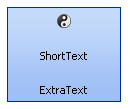
Figure 8 – Content in centered for spread out vertically
If you need to squeeze the content more closely together then you have two options. The preferred method is to auto size the control so that it automatically resizes to be just big enough to hold the content. You could also add a larger Padding value so that the spare space is reduced forcing the content closer together. Figure 9 shows the auto sizing approach followed by the Padding approach where it has been defined as 22 pixels of padding for each edge. The last picture in Figure 9 shows both the auto sizing and Padding applied to the same control.
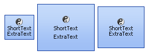
Figure 9 – AutoSize, Padding and both
Image Properties
As you can see from Figure 10 the Image property has five child properties of which the ImageH and ImageV have already been described above. The Effect property allows a color transition to be made at the time of drawing the actual image to the screen.
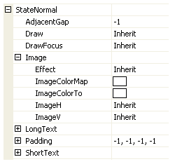
Figure 10 – Image child properties
The most commonly used enumeration values are the Normal, which just shows the image without any change, and Disabled which shows the image is a washed out appearance suitable for a disabled control. You can lighten or darken the image by using one of the Light, LightLight, Dark and DarkDark options. There are four options for performing gray scaling. GrayScale will convert all colors into black and white whilst GrayScaleRed, GrayScaleGreen and GrayScaleBlue convert all except the nominated color into gray scale. See figure 11 to see all the enumeration options applied.
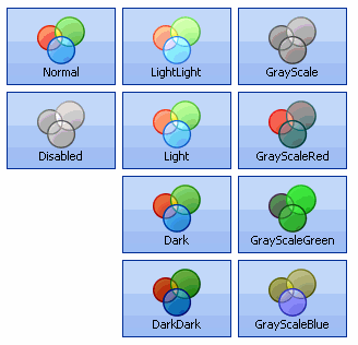
Figure 11 – Image Effect enumeration
When the image is being painted you can remap one of the image colors to an alternate. Use the ImageColorMap to specify the color you want to alter and use ImageColorTo to define the new output color. This is useful if you have just a single color image and want to alter the display color based on the tracking or pressed state. Figure 12 shows a black cross image in three colors. The left most image is the original Image without any color re mapping applied. In the second image the ImageColorMap = Black and ImageColorTo = Red. Last is the blue image which also has ImageColorMap = Black but ImageColorTo = Blue.

Figure 12 - Original image, ColorTo = Red, ColorTo = Blue
ShortText & LongText Properties
Figure 13 shows the full list of extra properties that are available for both the ShortText and LongText. The TextV and TextH properties have already been described above in the section about positioning.
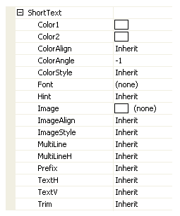
Figure 13 – ShortText child properties
The ColorStyle property determines how to make use of the Color1, Color2, ColorAlign and ColorAngle set properties. When ColorStyle is defined as Solid the text will be drawn using the Color1 value and the other color properties are ignored as not relevant. Figure 14 shows some KryptonLabel instances with Solid defined.

Figure 14 – ColorStyle = Solid
All other ColorStyle values such as Linear and Rounded allow a gradient effect between two colors, where Color1 is the starting color and Color2 is the ending color. Now the ColorAngle property becomes important as it determines the direction in which the transition occurs. Figure 15 shows the same Linear style and same starting and ending colors but with different angles.

Figure 15 – ColorStyle = Linear
ColorAlign is used to decide how to calculate the starting and ending points for the gradient effect. By default it will always start at the top left of the control and ends at the bottom right of the control which gives an appearance as seen already in Figure 15. If instead you choose the Form level alignment then it will use the top left of the enclosing form and bottom right of the enclosing form as the total area of the gradient. Figure 16 shows four label controls all with exactly the same ColorAngle of 45 degrees, ColorAlign of Form and ColorStyle of Sigma.

Figure 16 – ColorStyle =Sigma, ColorAlign = Form, ColorAngle = 45
Font and Hint are used to define the text font used when drawing and the quality of the font rendering. Figure 17 shows the Font modified between the first and second instances. The third instance is exactly the same as the second but with the Hint defined as AntiAlias.
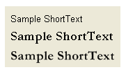
Figure 17 – Font and Hint properties
Rather than just use colors you can also draw an Image over the text. Note that the Image is always drawn after the color has been painted so that images that contain alpha channels will show through the defined color effect.
The ImageAlign property allows the image to be draw aligned against the Form and not just the control instance. Figure 18 shows the use of many KryptonLabel controls that are all assigned the same Image, ImageAlign and ImageEffect.
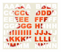
Figure 18 – ImageAlign = Form, ImageEffect = Stretch
The ImageEffect property describes how to draw the Image over the required area. Figure 18 shows the example where Stretch is used to ensure the Image exactly covers the entire area. Tiling options include Tile, TileFlipX, TileFlipY and TileFlipXY that repeat over and over again until the entire area is filled. Positioning options such as TopLeft and BottomMiddle allow the image to be placed relative to both the vertical and horizontal edges.
Prefix has three possible values that determine how to process the ampersand character inside the text string. None specifies that no pre-processing of ampersand characters take place so the output is the exact string provided. Hide will process ampersand characters but will not underline the output text. Show will process ampersand characters and place an underline under the next character. Figure 19 shows the each of the three options.
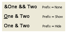
Figure 19 – Prefix options
Each ShortText and LongText can contain carriage returns and so span multiple lines of text. This is the default setting for MultiLine but if you prefer to have all the text always on a single line then just set the property to False. When text spans multiple lines then you can use the MultiLineH property to define how the lines are aligned. Figure 20 shows an example of text containing a carriage return being forced to show on a single line and then an example of the three alignment options.
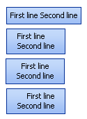
Figure 20 – MultiLine and MultiLineH properties
Finally the Trim property is used to specify how to handle text when there is not enough room to display it all. If you would like the text to disappear then use the Hide option. Alternatively you can use the Character or Word options to remove the excess characters or words that that will not fit. If you would like the user to be made aware that truncation has taken place then use one of the ellipses options EllipsesCharacter, EllipsesWord or EllipsesPath. Figure 21 shows the various options in action.
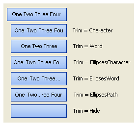
Figure 21 - Trim options